Based on yesterday’s speech bubble designs, I’ve spent today working out some other interface elements. Apart from the game’s main menu (and potentially a separate pause menu), there are two main GUI elements which will keep a consistent style throughout the game. One of these is the HUD (Heads Up Display), and the other is the game’s inventory.
The HUD

I was previously using a placeholder HUD which shows information about the amount of flowers collected and the player’s health. The reason I placed this here temporarily was mainly as a debug object for me to test when damage was being taken and how well the flower collection ds_list was working. In the finished game, the HUD will be a quick insight into level progress, showing the same information just in a nicer graphical style.
I’ve had a quick look into how other Indie developments have incorporated HUD systems and found that they tend to be very basic, using simple icons and in some cases text only. This example from Ninja Senki is a very clear way of displaying information which doesn’t get confused with any other element on screen.
So, simple is good. There doesn’t seem much point in clogging up the screen with pointless graphics unless they are meaningful or relevant. The HUD should be concise and to the point, so that the player can glance at it quickly and get a good impression of the information displayed.
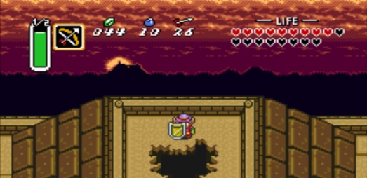
The Legend of Zelda: A Link to the Past has a fairly complex HUD system, but enforces clarity by using unique icons and indicators rather than using text.

Key:
The Green Bar (far left) represents special ability charge levels
The Bow Icon (left) represents the secondary item equipped
The Green Gem icon represents the amount of rupees the player has
The Bomb icon represents the amount of bombs the player has
The Arrow icon represents the amount of arrows the player has
The Heart Capsules (far right) represents the player’s hit points.
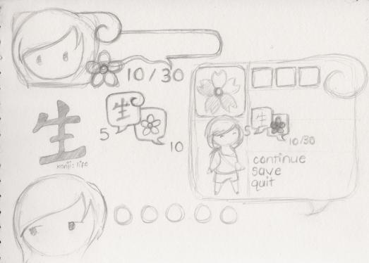
This sounds complicated to explain, but each feature is added into the game gradually, allowing the player time to get to know the HUD and where to look for info. I’ve kept this in mind whilst designing my HUD object, even though mine will only display two pieces of information! Originally, I wanted to swap my HP figure for a sliding health bar, but keep the flower icon to display info on how many flowers had been collected. Giving it some thought, I’ve moved onto a health system which is more like Zelda’s heart capsules. Because Hana will only take 5 hits before “dying”, and each obstacle deals the same amount of damage, I thought it would be more appropriate to create an image which shows each individual hit point. You can see my thought progression in the sketches I did this morning…

I’ve tried to keep the window shape and style similar to that of the speech bubbles, which will now be a consistent theme throughout the GUI. I’ve added the character profile picture partly as a way of indicating “this is player health and partly because of some advice from I found in a forum about pixel art games- A 16×16 pixel character is an extremely distorted version of a character design, and showing a higher resolution image of the character somewhere in the game acts as a little player gratuity. On the right hand side of the image you can see a rough design for a menu/inventory, where I’m thinking of using an even large character image, based on my main concept art for Hana.
The size of the “high-res” head-shot is just over 32×32 pixels, twice the size of the entire original sprite. This took an unpredicted amount of time to create, because of the increased opportunities for detail in the drawing! I wasn’t originally sure what I was going to use as a representation of a hit point, but liked the idea of using something rounded. In the end, I’ve gone for a Japanese coin look!

This now sits in place of the old HUD, the only real similarity is that I’m still using a string of text to display how many flowers have been collected.
The Inventory Menu
I haven’t managed to fully design the inventory yet, but I’ve planned out everything that should go in it! Information like:
- An even higher resolution character image
- Character health
- Health restoration items collected
- Flowers Collected
- Petals Collected
- Perhaps a little info on level (at least some indication of which level the player is currently on!)
After getting to grips with the enlarged head image that I drew earlier, I thought I’d work on the full character image first! As the menu is likely to take up the majority of the screen, I’ve created this image at a height of 100 pixels (which is scaled up to 300 when displayed in the game). This is basically a pixelated version of one of my previous sketches.

To give you an indication of size relative to the game sprite and other elements, I quickly whipped up this scary little image where I placed the new drawing into the game:


First off, love your blog it’s very interesting to read. I don’t know if you’re open to suggestions but in my opinion you might want to scale down the HUD a bit. The relative size between the HUD and the last picture you posted (With the giant game sprite) seems perfect. Just the pictures before that the HUD seemed way too big for the game screen. I’m not sure if you just enlarged it for testing/viewing purposes but in any case I just thought I would let you know my opinion.
Thanks, I’m glad you find it interesting :S
The first couple of images are actually zoomed in- you can probably see about a quarter of the screen in each, whereas the last image shows much more of the whole image. So hopefully no rescaling needed, because re-scaling pixel stuff by small amounts can be pretty tricky.
I always like suggestions though- keep ’em coming!
I really like the UI choices, especially the coins-like symbols for health. Will there be any chance of a playable demo-build at some point?
Thanks for your kind words!
I don’t know if I’ve made it very clear anywhere on my blog, but I’m actually making this for my extended major project for uni, which is why I’m trying to painstakingly document everything down to the smallest detail ¬_¬. So there will probably be a release of a “playable something” by the project deadline in May, fingers crossed!